


Photo by Markus Winkler on Unsplash
Full featured form using NextJS Server Actions
Zero cost Contact Form for developer portfolio website using NextJS, Server Actions, Gmail, Nodemailer, Shadcn-ui and TailwindCSS


We are going to build a contact form using Nextjs and Server Actions. When the user submit the form it should send an email to your personal email account.
Bootstrap The Project
Generate a new Nextjs project and accept all the default settings, then install necessary dependencies.
npx create-next-app@latest contact-form
cd contact-form
yarn add nodemailer zod
yarn add -D @types/nodemailer
We have installed nodemailer for sending email and zod for validation.
Now install shadcn-ui and add some necessary UI components using their CLI.
npx shadcn-ui@latest init
npx shadcn-ui@latest add button card input label textarea toast
Shadcn should already generate its UI components into /src/components/ui directory. Now we are ready to implement our form.
Implement ContactForm component
// src/components/forms/ContactForm.tsx
import React from "react";
import { Label } from "../ui/label";
import { Button } from "../ui/button";
import { Input } from "../ui/input";
import { Textarea } from "../ui/textarea";
import { sendEmail } from "@/actions/sendEmail";

function ContactForm() {
  return (
    <form action={sendEmail} className="flex flex-col space-y-4">
      <div className="flex flex-col space-y-1.5">
        <Label htmlFor="name">Name</Label>
        <Input id="name" name="name" type="text" placeholder="John Doe" />
      </div>
      <div className="flex flex-col space-y-1.5">
        <Label htmlFor="email">Email</Label>
        <Input
          id="email"
          name="email"
          type="email"
          placeholder="john@example.com"
        />
      </div>
      <div className="flex flex-col space-y-1.5">
        <Label htmlFor="message">Message</Label>
        <Textarea
          id="message"
          name="message"
          placeholder="Your message here..."
          className="input"
        />
      </div>
      <Button type="submit">Submit</Button>
    </form>
  );
}

export default ContactForm;
Notice, in the form element we are using action attribute instead of onSubmit. Another important thing is, we do not need any useState hooks for storing form field values. Instead, we are using built-in html features for handling forms. Therefore the code is much simpler and less verbose.
Now look at the form element, <form action={sendEmail}>. Here, sendEmail is our Server Action (async function that runs on the server only) which is not implemented yet. Let's do implement that.
Implement sendEmail Server Action
// src/actions/sendEmail.ts
"use server";
import { createTransport } from "nodemailer";

// read environment variables
const RECEIVING_EMAIL = process.env.RECEIVING_EMAIL as string;
const SENDING_EMAIL = process.env.SENDING_EMAIL as string;
const SENDING_EMAIL_PASSWORD = process.env.SENDING_EMAIL_PASSWORD as string;

// create nodemailer transport for sending email
const transporter = createTransport({
  host: "smtp.gmail.com",
  port: 465,
  secure: true,
  auth: {
    user: SENDING_EMAIL,
    pass: SENDING_EMAIL_PASSWORD,
  },
});

export async function sendEmail(formData: FormData) {
  const name = formData.get("name") as string;
  const email = formData.get("email") as string;
  const message = formData.get("message") as string;

  const mailOptions = {
    from: { name: "Contact Me", address: SENDING_EMAIL },
    to: RECEIVING_EMAIL,
    replyTo: email,
    subject: `${name} <${email}>`,
    text: message,
    html: `
      <div>${message.replace(/\n/g, "<br>")}</div>
    `,
  };

  try {
    const sentMessageInfo = await transporter.sendMail(mailOptions);
    console.log("Message sent: %s", JSON.stringify(sentMessageInfo, null, 2));
    return {
      success: true, // let the client know the action was succeeded
      message: "Thank you for the message!", // message to display in the UI
    };
  } catch (err) {
    console.error(err);
    return {
      success: false, // let the client know the action was failed
      error: "Something went wrong!", // error description
      message: "Something went wrong!", // message to display in the UI
    };
  }
}
use server
"use server" directive. This will ensure this code will run in the server only, and nothing will be added into the client side javascript bundle. Therefore this file is secured for using secrets like email and password.We have read three environment variables in the top.
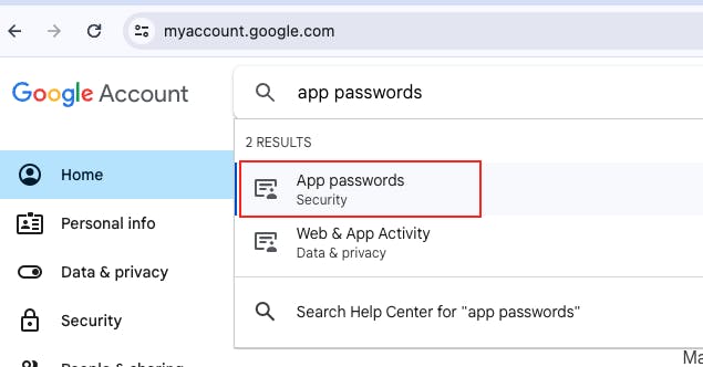
RECEIVING_EMAIL: your primary email address where you want to receive all emails.SENDING_EMAIL: this one is ano-replyemail address, which is used only for sending emails.SENDING_EMAIL_PASSWORD: app specific password for your sending email.
App password is different from your regular password that you use for logging into gmail account. App password is used for accessing your gmail account programmatically.
To generate an app password go to https://myaccount.google.com and search for
App Passwords. Then follow the instructions in the screen.
Insert all these three environment variables into the .env file.
SENDING_EMAIL=no-reply@gmail.com
SENDING_EMAIL_PASSWORD=secret_app_password
RECEIVING_EMAIL=primaryemail@example.com
Notice how we created nodemailer transport and use that to send the email. We always return success, message and error from the server action. So, the client component can use these values to update its UI, i.e. display the message using a toast or alert.
Show the form in the page
Now our ContactForm and the Server Action is ready to use. So, update the page component and display the contact form there.
// src/app/page.tsx
import ContactForm from "@/components/forms/ContactForm";
import {
Card,
CardContent,
CardDescription,
CardHeader,
CardTitle,
} from "@/components/ui/card";
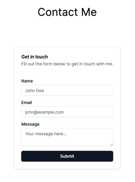
export default function Home() {
return (
<main className="flex flex-col items-center justify-center p-24">
<h1 className="text-4xl mb-24">Contact Me</h1>
<Card>
<CardHeader>
<CardTitle>Get in touch</CardTitle>
<CardDescription>
Fill out the form below to get in touch with me.
</CardDescription>
</CardHeader>
<CardContent>
<ContactForm />
</CardContent>
</Card>
</main>
);
}
If you run the project now, hopefully you'll be able to see the contact form working. Good thing is, our form component is very concise, because we do not need to use useState hooks for storing form values. Another good thing is, we do not need to setup API route for Server Action. However, there are few things to consider,
Submit button does not have a loading state.
No success/error message showing in the UI.
Our form does not cleanup when the mail is sent successfully.
There is no form validation.
We will fix all these in next few steps.
Submit button loading state
We can use the useFormStatus hook to monitor current form submission status. The hook returns information like the pending property which tells you if the form is actively submitting.
However, there is a gotcha, the hook only works if it is called from a component which is rendered inside a <form>. This means, it will not work if we call the hook from our ContactForm component, because it is not rendered inside <form>, rather it is rendering the form. To solve this problem, we will extract the Submit button into a separate component and call the hook from there.
Create SubmitButton component like below:
// src/components/forms/SubmitButton.tsx
"use client";
import React from "react";
import { useFormStatus } from "react-dom";
import { ReloadIcon } from "@radix-ui/react-icons";
import { Button, ButtonProps } from "../ui/button";

type SubmitButtonProps = ButtonProps & { children?: React.ReactNode };

function SubmitButton({ children, ...rest }: SubmitButtonProps) {
  const { pending } = useFormStatus();

  return (
    <Button {...rest} disabled={pending}>
      {pending && <ReloadIcon className="animate-spin mr-2" />}
      {children}
    </Button>
  );
}

export default SubmitButton;
Now, use this SubmitButton component inside the ContactForm component.
// src/components/forms/ContactForm.tsx
...
-import { Button } from "../ui/button";
+import SubmitButton from "./SubmitButton";
...
function ContactForm() {
  return (
    <form action={sendEmail} className="flex flex-col space-y-4">
      ...
-      <Button type="submit">Submit</Button>
+      <SubmitButton type="submit">Submit</SubmitButton>
    </form>
  );
}
...
You should be able to see beautiful loading state when you submit the form now.
Display toast message
Our server action returns a response with success status, error if any, and message to display in the UI. But we are not using any of these informations yet.
We can use the useFormState hook to update the UI based on the result from our Server Action. Let's update the ContactForm component and show toast message based on the result from the Server Action.
// src/components/forms/ContactForm.tsx
...
import { toast } from "../ui/use-toast";
import { useFormState } from "react-dom";
// initial state for the useFormState hook
const initialState = {
success: null,
error: null,
message: null,
};
function ContactForm() {
const [{ success, message, error }, formAction] = useFormState(
sendEmail,
initialState
);
// display toast based on the success status
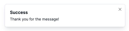
if (success === true) {
toast({ title: "Success", description: message, variant: "default" });
} else if(success ===false) {
toast({ title: "Error", description: message, variant: "destructive" });
}
return (
// instead of using the sendEmail function,
// we use the formAction function as the action
<form action={formAction} className="flex flex-col space-y-4">
...
</form>
);
}
As we are passing the sendEmail action to the useFormState hook, the sendMail action will get a new first argument called current state. We need to make a small change into our action to allow this first argument.
// src/actions/sendEmail.ts
-export async function sendEmail(formData: FormData) {
+export async function sendEmail(currentState: any, formData: FormData) {
To make this toast function work properly we need to render the Toaster component from shadcn in a parent component (typically in the root layout component). Let's update the root layout component like below.
// src/app/layout.tsx
...
import { Toaster } from "@/components/ui/toaster";
...
export default function RootLayout({
  children,
}: Readonly<{
  children: React.ReactNode;
}>) {
  return (
    <html lang="en">
      <body className={inter.className}>
        {children}
        <Toaster />
      </body>
    </html>
  );
}
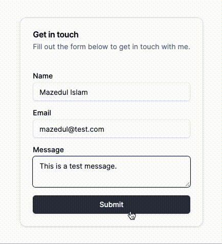
If you try sending a message now, you should be able to see a nice toast message.
Cleanup the form
Form is submitted successfully but it is still remains populated with the entered data. To cleanup the form, we need a reference to the <form> element. Update the ContactForm component like below.
// src/components/forms/ContactForm.tsx
"use client";
import React, { useRef } from "react";
...
function ContactForm() {
  const ref = useRef<HTMLFormElement>(null);
  ...
  if (success === true) {
    toast({ title: "Success", description: message, variant: "default" });
    ref.current?.reset(); // cleanup the form here
  }
  ...
  return (
    <form action={formAction} ref={ref} className="flex flex-col space-y-4">
    ...
  )
}
...
If the form action succeeded then the form will be cleaned up from now.
Form validation
Validation can be done in two places, client side and server side validation. We are going to focus on the server side validation in this article. Our goal is to display error message for each fields separately.
At first, install zod for validation.
yarn add zod
Now create a validator using zod.
// src/actions/validators/ContactFormValidator.ts
import { z } from "zod";

// zod schema for contact form
export const ContactFormSchema = z.object({
  name: z.string().min(2, { message: "Name must be at least 2 characters" }),
  email: z.string().email({ message: "Please provide a valid email address" }),
  message: z.string().min(10, { message: "Please elaborate your message" }),
});

export type ContactFormFlattenedErrors = z.inferFlattenedErrors<
  typeof ContactFormSchema
>;

// error types we are going to return from the sendEmail server action
export enum ContactFormErrorType {
  Internal = "Internal",
  ZodFieldErrors = "ZodFieldErrors",
}

// return type of sendEmail server action
export type SendEmailResponse = {
  success: boolean | null; // Whether the email was sent successfully
  error?: string | ContactFormFlattenedErrors["fieldErrors"] | null; // If success is false, this will be the error object or string
  errorType?: ContactFormErrorType | null; // If success is false, this will be the type of error
  message?: string | null; // Message (success/failure) should be displayed to the user
};
Let's update our sendEmail action and utilise the zod validator there.
// src/actions/sendEmail.ts
"use server";
import { createTransport } from "nodemailer";
import {
  SendEmailResponse,
  ContactFormSchema,
  ContactFormFlattenedErrors,
  ContactFormErrorType,
} from "./validators/ContactFormValidator";

// read environment variables
const RECEIVING_EMAIL = process.env.RECEIVING_EMAIL as string;
const SENDING_EMAIL = process.env.SENDING_EMAIL as string;
const SENDING_EMAIL_PASSWORD = process.env.SENDING_EMAIL_PASSWORD as string;

// create nodemailer transport for sending email
const transporter = createTransport({
  host: "smtp.gmail.com",
  port: 465,
  secure: true,
  auth: {
    user: SENDING_EMAIL,
    pass: SENDING_EMAIL_PASSWORD,
  },
});

export async function sendEmail(
  currentState: SendEmailResponse,
  formData: FormData
): Promise<SendEmailResponse> {
  const name = formData.get("name") as string;
  const email = formData.get("email") as string;
  const message = formData.get("message") as string;

  // validate using zod schema here
  const validatedData = ContactFormSchema.safeParse({ name, email, message });

  if (!validatedData.success) {
    // return early if validation failed
    const flattenedErrors: ContactFormFlattenedErrors =
      validatedData.error.flatten();
    return {
      success: false,
      error: flattenedErrors.fieldErrors,
      errorType: ContactFormErrorType.ZodFieldErrors,
    };
  }

  const mailOptions = {
    from: { name: "Contact Me", address: SENDING_EMAIL },
    to: RECEIVING_EMAIL,
    replyTo: email,
    subject: `${name} <${email}>`,
    text: message,
    html: `
      <div>${message.replace(/\n/g, "<br>")}</div>
    `,
  };

  try {
    const sentMessageInfo = await transporter.sendMail(mailOptions);
    console.log("Message sent: %s", JSON.stringify(sentMessageInfo, null, 2));
    return {
      success: true,
      message: "Thank you for the message!",
    };
  } catch (err) {
    console.error(err);
    return {
      success: false,
      error: "Something went wrong!",
      errorType: ContactFormErrorType.Internal,
      message: "Something went wrong!",
    };
  }
}
Notice that, when zod validation failed, we are sending
errorType = ContactFormErrorType.ZodFieldErrors and attach the flattened error fields in the error property of the returned object. This flattened field errors will be used to display error messages under corresponding input element in the ContactForm component.
For any other errors we are sending errorType = ContactFormErrorType.Internal with a generic error i.e. Something went wrong!. This generic error will be displayed in the toast message.
Our goal is to display error messages in red colour under corresponding input element. Let's create a separate component for this.
// src/components/ui/typography.tsx
import React from "react";
import { VariantProps, cva } from "class-variance-authority";
import { cn } from "@/lib/utils";

const typographySmallVariants = cva("text-sm font-light leading-none", {
  variants: {
    variant: {
      default: "text-primary",
      destructive: "text-destructive",
    },
  },
  defaultVariants: {
    variant: "default",
  },
});

export interface TypographySmallProps
  extends React.HTMLAttributes<HTMLSpanElement>,
    VariantProps<typeof typographySmallVariants> {}

export const TypographySmall = React.forwardRef<
  HTMLSpanElement,
  TypographySmallProps
>(function TypographySmall({ className, variant, ...props }, ref) {
  return (
    <small
      className={cn(typographySmallVariants({ variant, className }))}
      ref={ref}
      {...props}
    />
  );
});
We exported TypographySmall component which renders HTML <small> element. This component also have two variants, default and destructive. We'll use the destructive variant for displaying error message in red colour.
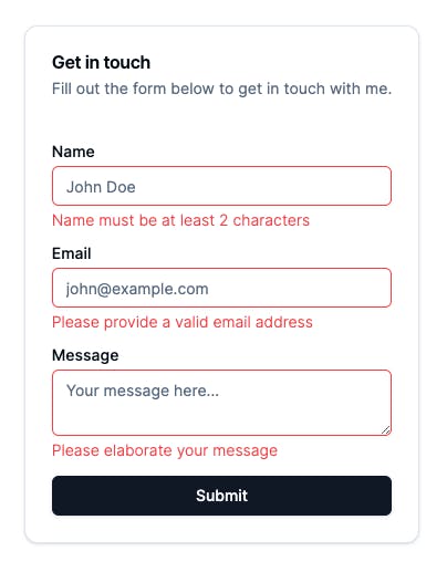
Now, let's update the ContactForm component. Here is the updated ContactForm component.
// src/components/forms/ContactForm.tsx
"use client";
import React, { useRef } from "react";
import { Label } from "../ui/label";
import { Input } from "../ui/input";
import { Textarea } from "../ui/textarea";
import { sendEmail } from "@/actions/sendEmail";
import { type SendEmailResponse } from "@/actions/validators/ContactFormValidator";
import SubmitButton from "./SubmitButton";
import { toast } from "../ui/use-toast";
import { useFormState } from "react-dom";
import { TypographySmall } from "../ui/typography";
import { isObject } from "@/lib/isObject";
import clsx from "clsx";

// initial state of the form
const initialState: SendEmailResponse = {
  success: null,
  error: null,
  errorType: null,
  message: null,
};

function ContactForm() {
  const ref = useRef<HTMLFormElement>(null);
  // success, message, error, errorType will get the returned values from the sendEmail action
  const [{ success, message, error, errorType }, formAction] = useFormState(
    sendEmail,
    initialState
  );

  if (success === true) {
    // show success toast
    toast({ title: "Success", description: message, variant: "default" });
    // cleanup the form
    ref.current?.reset();
  } else if (success === false && errorType === "Internal") {
    // if error type is Internal then show toast message
    toast({
      title: "Error",
      description: message,
      variant: "destructive",
    });
  }

  return (
    <form action={formAction} ref={ref} className="flex flex-col space-y-4">
      <div className="flex flex-col space-y-1.5">
        <Label htmlFor="name">Name</Label>
        <Input
          id="name"
          name="name"
          type="text"
          placeholder="John Doe"
          className={clsx({
            "border-destructive": isObject(error) && error.name,
          })}
        />
        {isObject(error) && error.name && (
          <TypographySmall variant="destructive">{error.name}</TypographySmall>
        )}
      </div>
      <div className="flex flex-col space-y-1.5">
        <Label htmlFor="email">Email</Label>
        <Input
          id="email"
          name="email"
          type="email"
          placeholder="john@example.com"
          className={clsx({
            "border-destructive": isObject(error) && error.email,
          })}
        />
        {isObject(error) && error.email && (
          <TypographySmall variant="destructive">{error.email}</TypographySmall>
        )}
      </div>
      <div className="flex flex-col space-y-1.5">
        <Label htmlFor="message">Message</Label>
        <Textarea
          id="message"
          name="message"
          placeholder="Your message here..."
          className={clsx({
            input: true,
            "border-destructive": isObject(error) && error.message,
          })}
        />
        {isObject(error) && error.message && (
          <TypographySmall variant="destructive">
            {error.message}
          </TypographySmall>
        )}
      </div>
      <SubmitButton type="submit">Submit</SubmitButton>
    </form>
  );
}

export default ContactForm;
We have conditionally render <TypographySmall> component under each input/textarea emelents. You might be noticed that we are using isObject utility function. It basically checks whether the error field is object or not. Code of this function is given below.
// src/lib/isObject.ts
export function isObject(value: any): value is Record<string, unknown> {
  return typeof value === "object" && value !== null;
}
That's it. Hopefully you'll be able to see field level errors now.
Conclusion
Complete code of this project can be found here: https://github.com/mazid1/contact-form-with-server-actions
If you have any concern, let me know in the comment section.
I'm open for a remote full-time/contract/freelance job for the position of Full-stack Software Engineer. If you are hiring, ping me at mazidmailbox@gmail.com